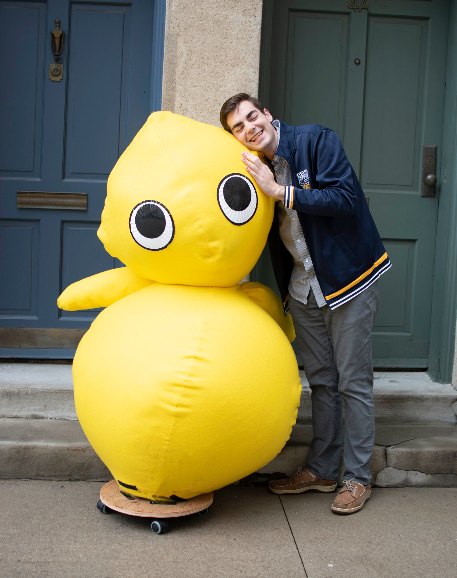
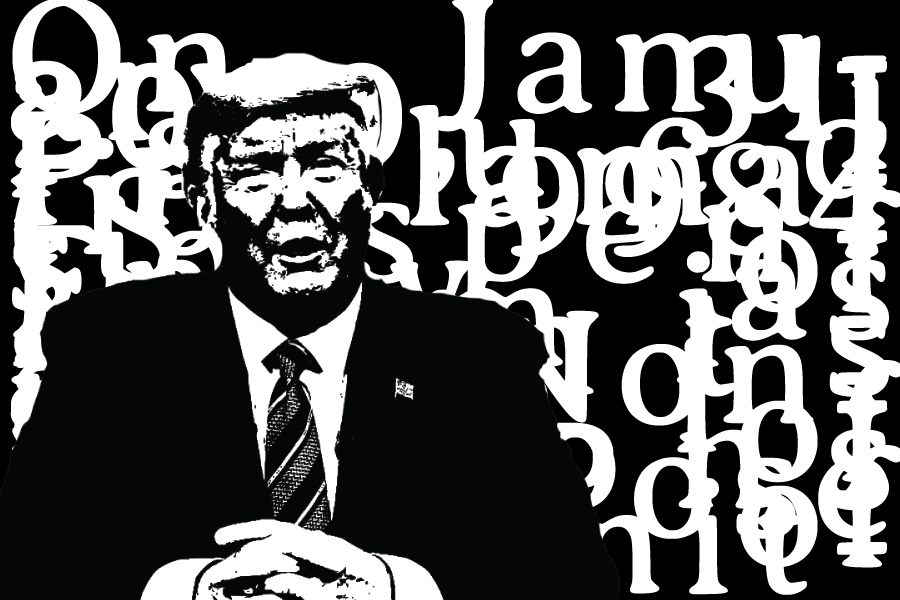
POTE
My intention was to create a character of rather ambiguous form who would serve as a source of comfort and happiness to its user. From personal experience the urban jungle is often overwhelming, and in a way of mocking its hustle and bustle I wanted to make something that was completely defunct of any function except friendliness. The choice of color and form immediately recall cuteness and comfort, further exhibited through tactile experience of plush felt and a soft balloon/ ball body. The importance of his mobility is to allow the artist to put it in the city context.
THE GUGGENHEIM BOOK
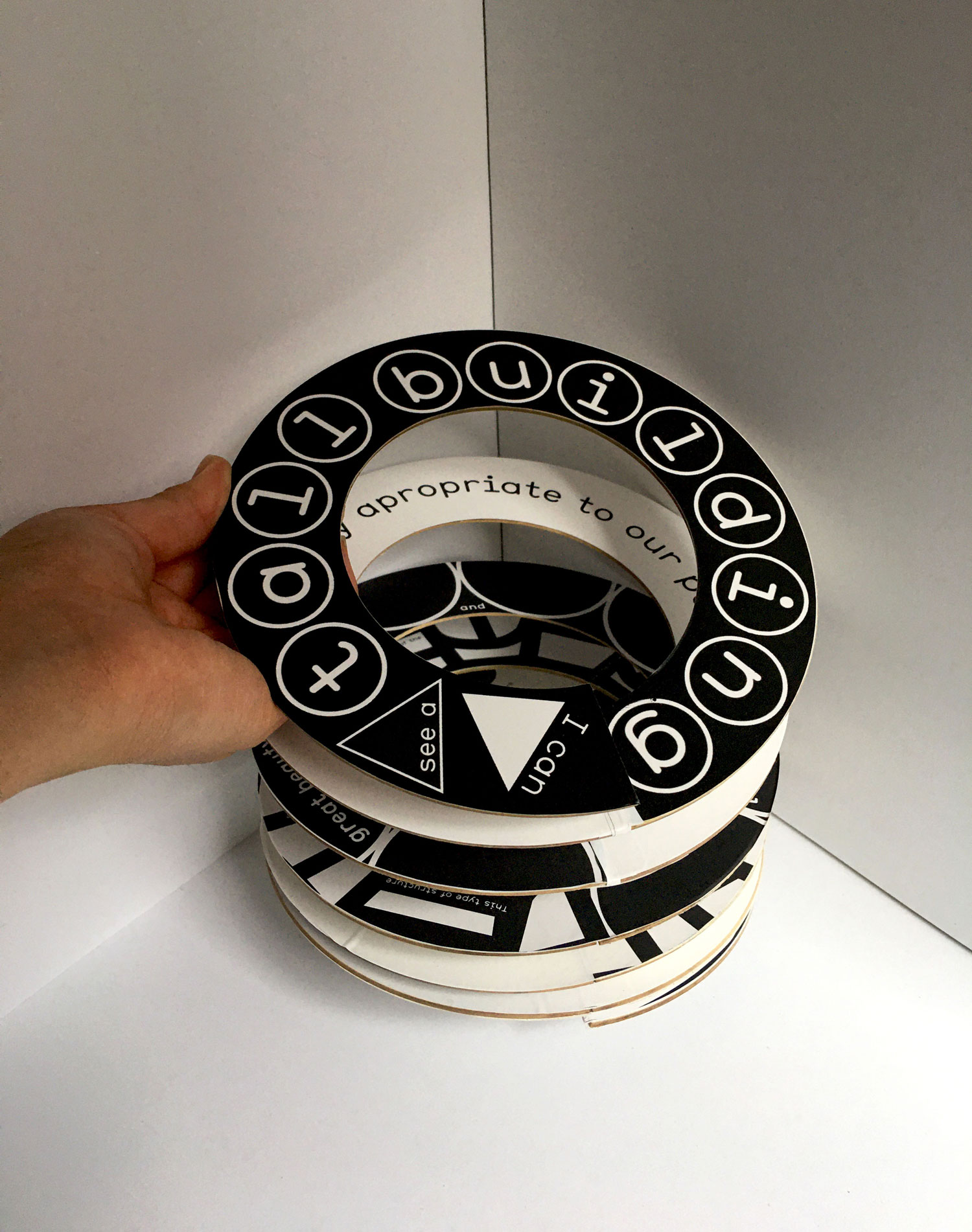
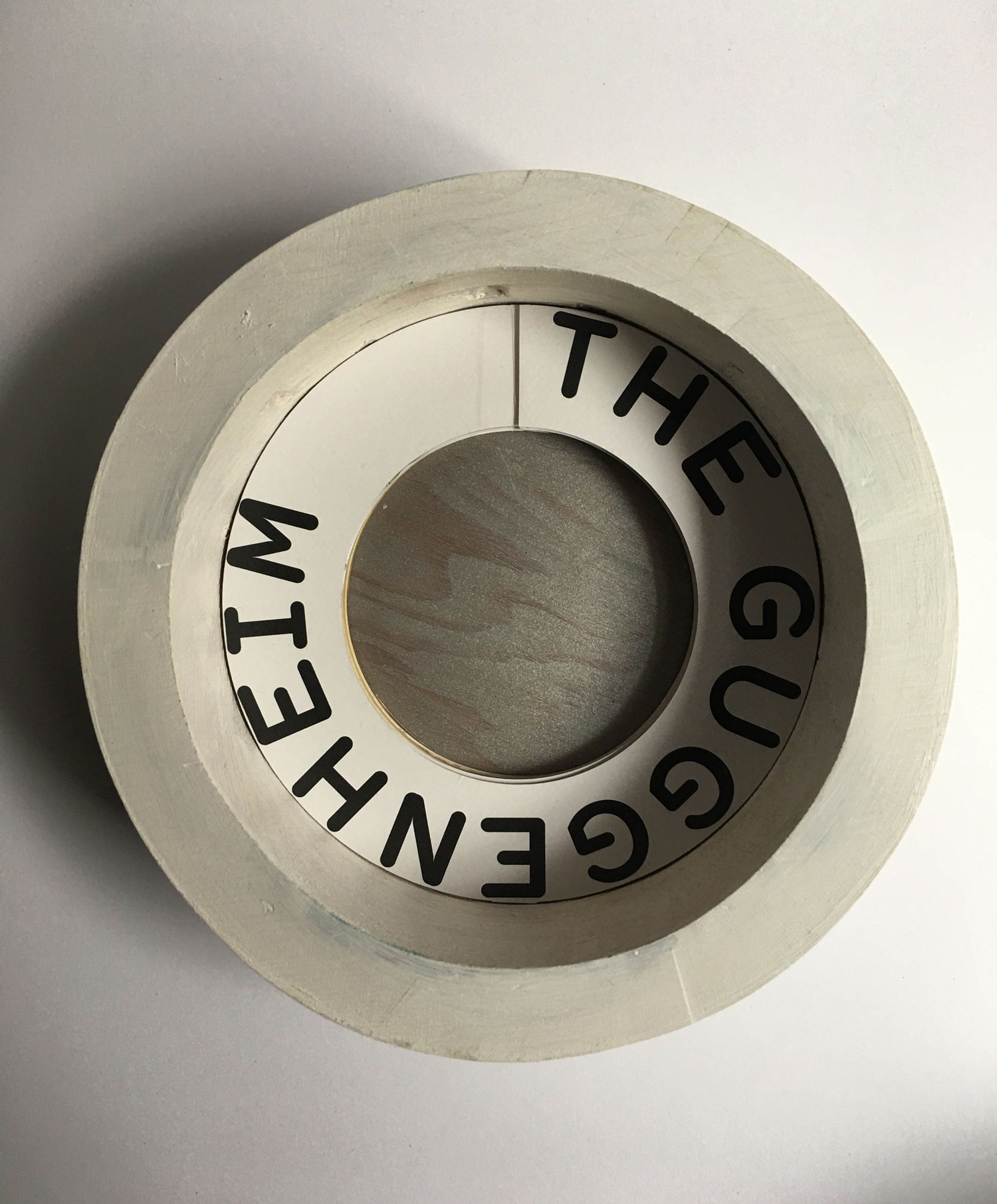
A project completed in two phases, with the first phase producing a typographical book and the second phase using its design with an elaborated form, this book serves as a narrative tour to Frank Lloyd Wright’s iconic museum architecture. The text comes from letters the architect wrote to the committee during the museum’s initial construction, while the graphics take direct inspiration from visual components of the building, and the design correlates with the dynamic navigation of the rotunda spiral. For example, the first page of the book takes place in the ascending elevator buttons, where the text narrates, “I can see a tall building…” From there the reader descends the spiral structure visually as they would in the museum, noting design forms replicated both inside and outside of the Guggenheim. The board book is placed inside a wooden ring, alluding to the upper ring of the museum building.
/
COVID-19
This personal project is a typographical exploration of my COVID experience in general, specifically looking into how to visually represent oppressing long distance enforced onto a transatlantic relationship. Inspired by the expressive typography work of Massin I wanted to experiment with a new medium of graphic visuals.
/
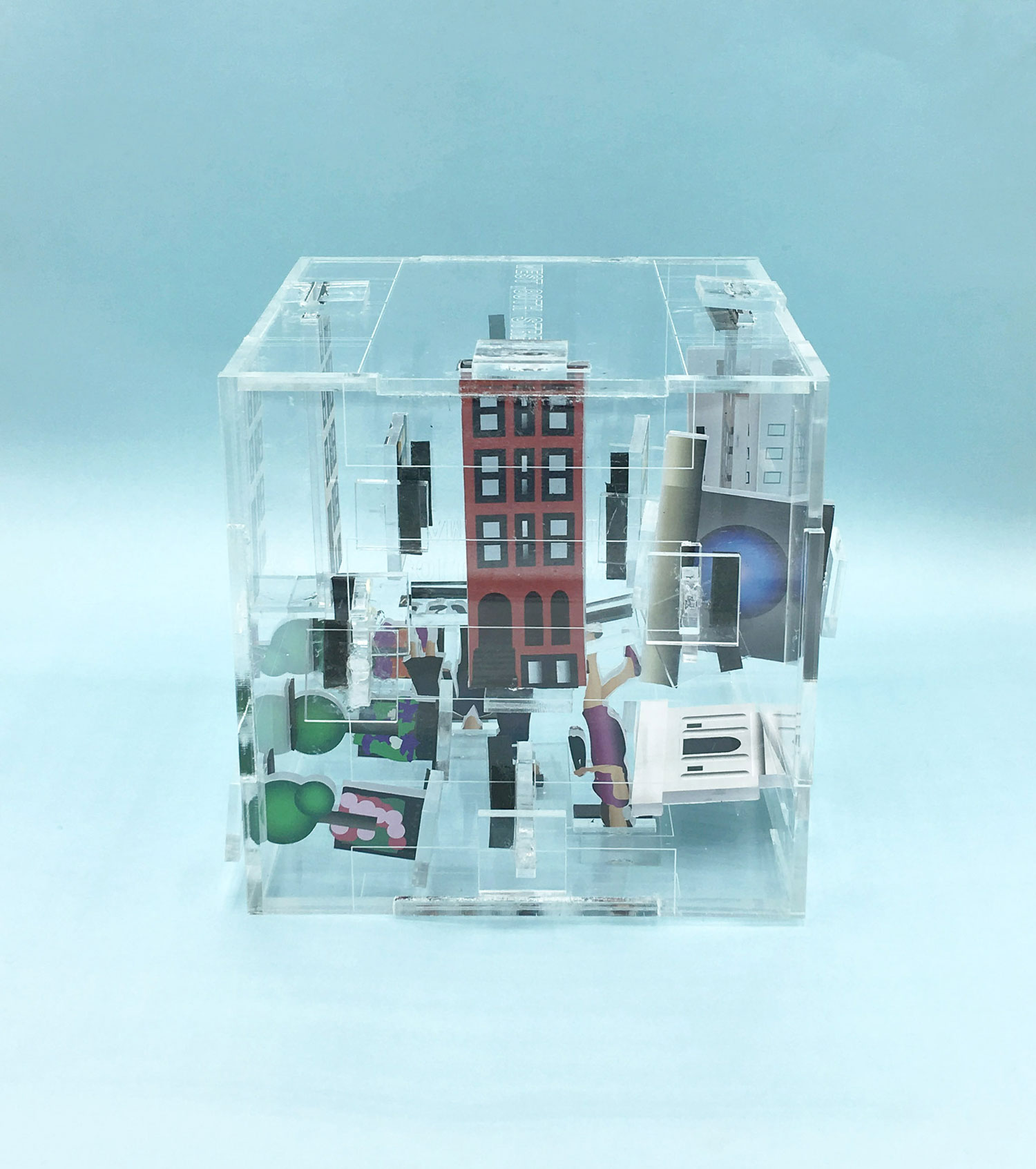
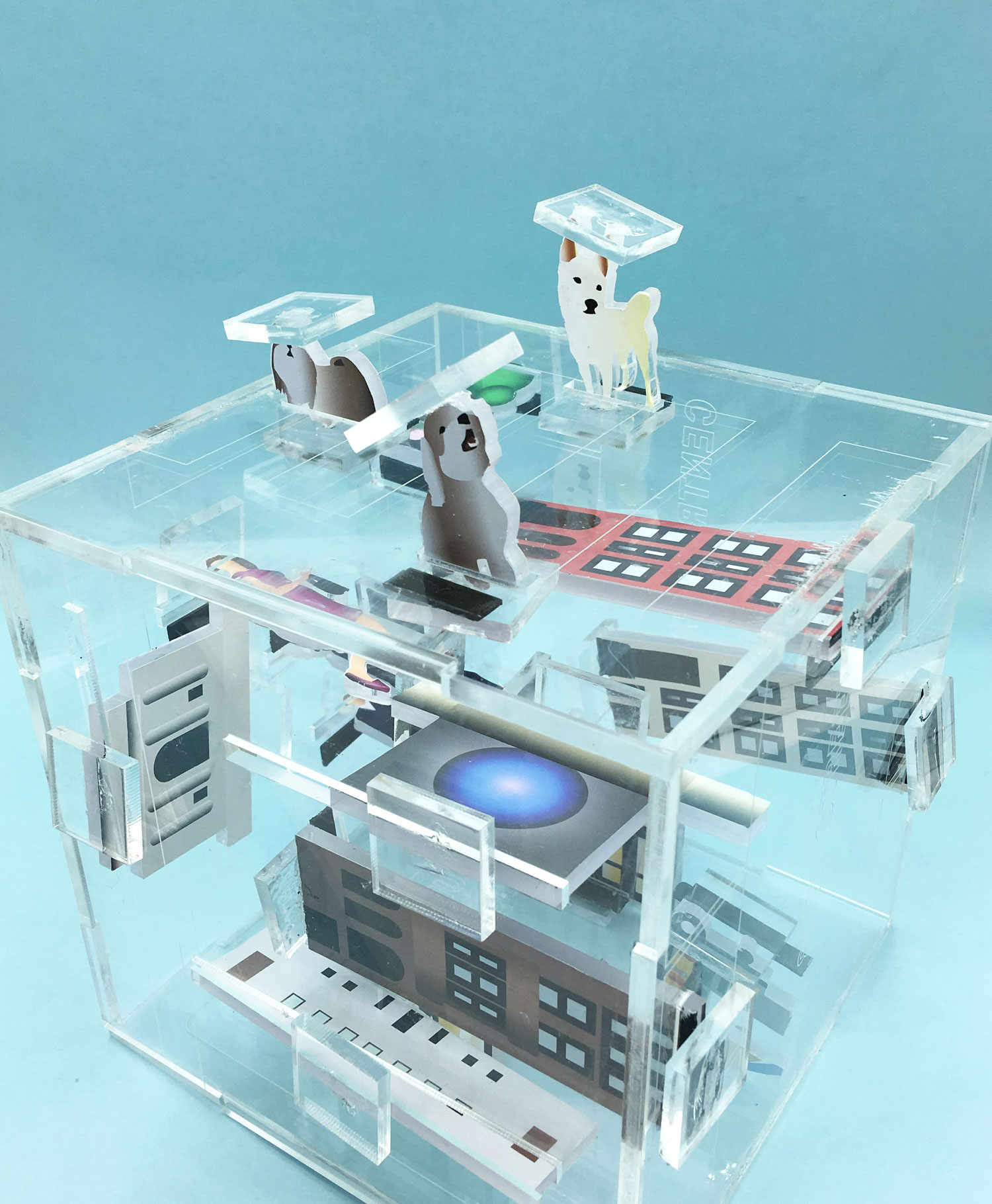
POP-UP BLOCK;
an Upper West Side Narrative
My intention was to capture a series of narrative scenes depicting my perceived experience of living in my upper west side neighborhood. From a very personal perspective, city dwelling is most enjoyable within the radius of my block, West 80th and the surrounding blocks around on the neighboring Columbus and Amsterdam avenues. Particular things to note about the area include the tight-knit community of young families who are familiar with each other, dogs who have better hair than I, and the plethora of eateries and activities.
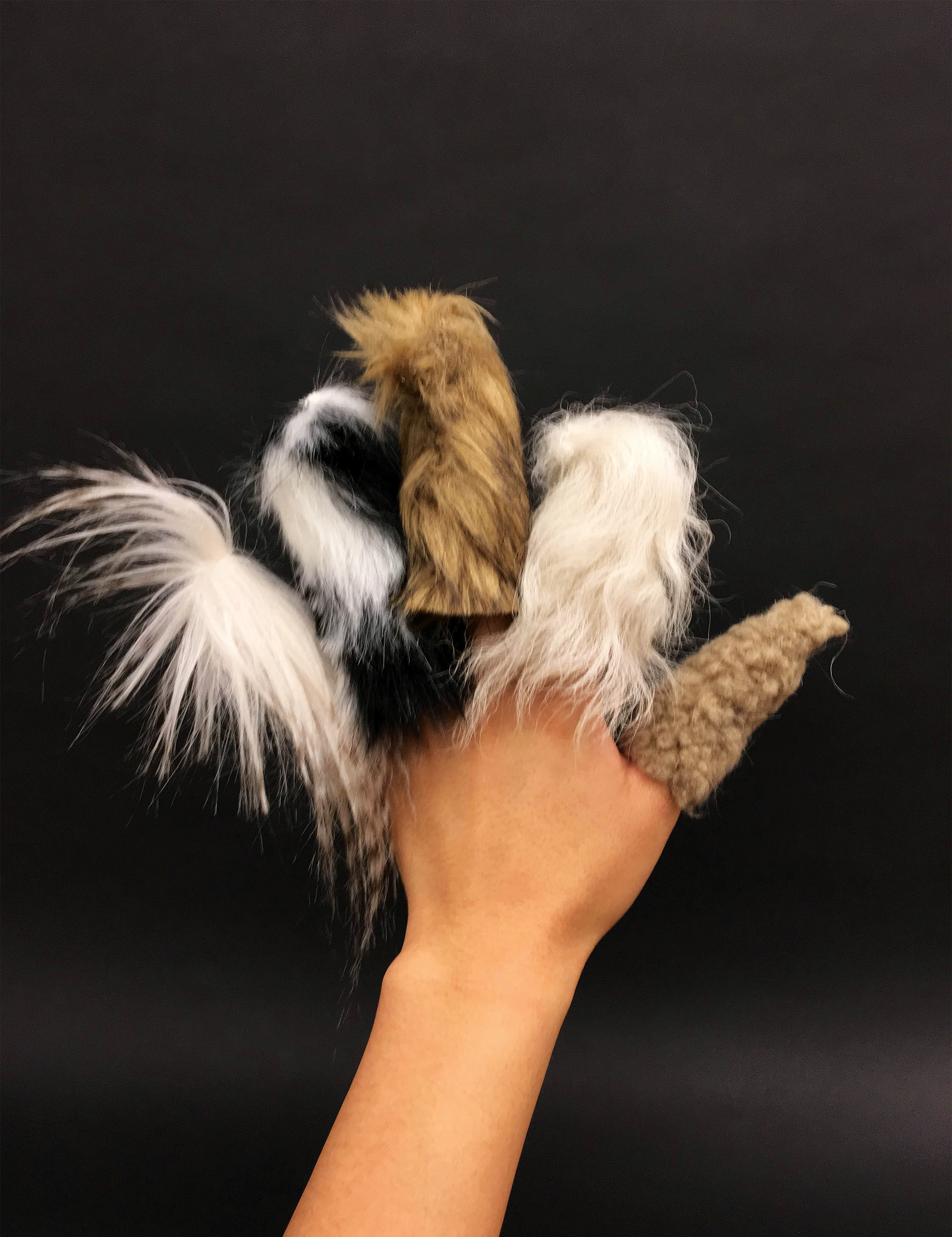
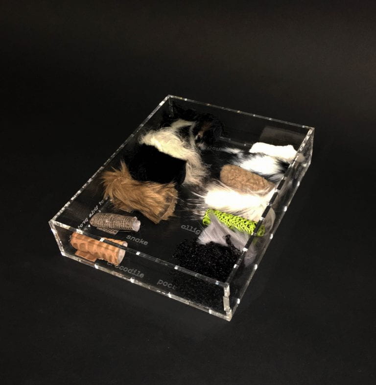
TACTILE TOOL
The intention of the project Tactile Tool was to approach the pedagogy of animal recognition from an alternative method. While we are often fed information which is phonetic or color-based for animal identification (for example, A is for Alligator, or a Bear is Black), the tactile qualities of an animals skin is hardly emphasized as an approach. To do so, I created a set of 14 finger puppets, each composed of a mimicking fur or skin to its corresponding animal. The puppets are meant to be stored/ displayed in their box, made of acrylic with laser cut engraved text identifying not only the box but the furs and skins on its interior. With each name sits a sample swatch of the fabric which the name of the animal it matches to.
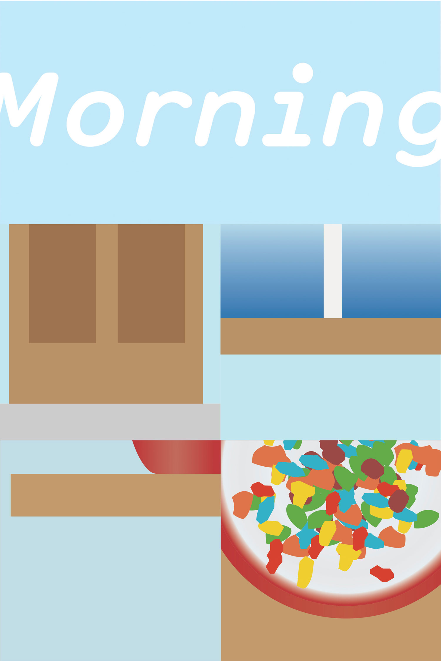
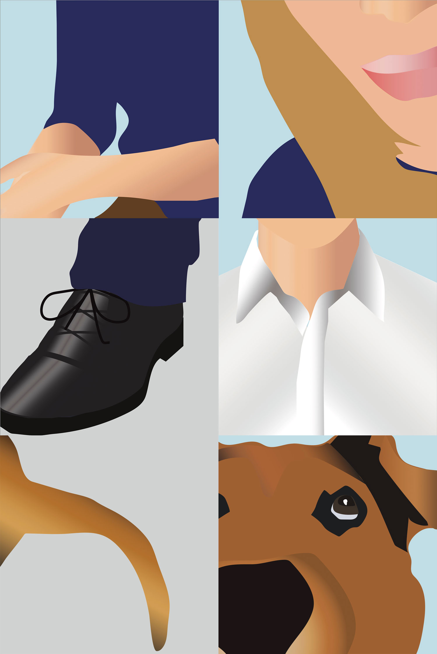
MORNING BOOK
A graphic book consisting of five spreads tells the story of a morning routine from the viewpoint of a young child. The images focus on form and color recognition, and serve as a narrative puzzle for an interactive reader. The first spread shows a window, and the child’s bedroom door, a child’s first perceptions upon waking up in the morning. In the second spread the reader is then shown the table, with the child’s breakfast bowl atop in the first page, and a zoomed-in view of the contents in the second. The third and fourth spreads show both the mother and father figures with a focus on their characteristics. And the story concludes with the dog, the first thing below or at our eye level. The cover of the book is a wrap-around graphic of its title Morning. Like the rest of the graphic narrative, the typography of the title is not easily legible, and requires further interaction to reveal its full form.
/
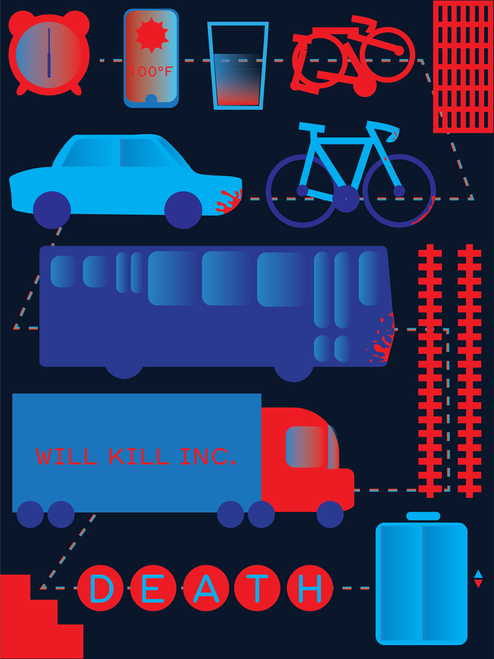
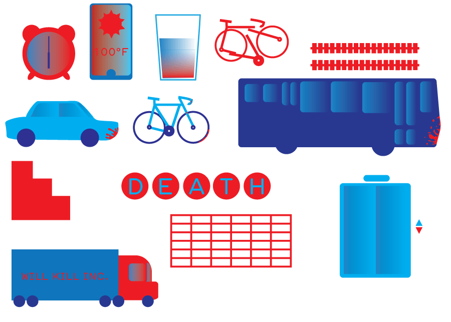
KILLER COMMUTE
This graphic design serves as a page for a children’s book addressing death. Using a limited color palette and simple geometric forms, the imagery makes an unsavory subject digestible to the audience, while the cynical concept is all but relatable for adults. The graphics form a map, from the time of waking up to the arrival at one's place of work, with iconography representing all the ways one could die from start to finish in an urban environment alone.
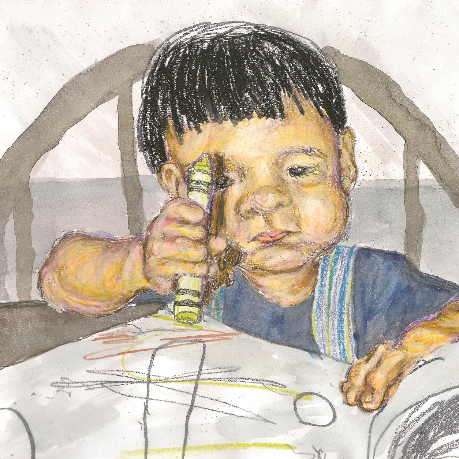
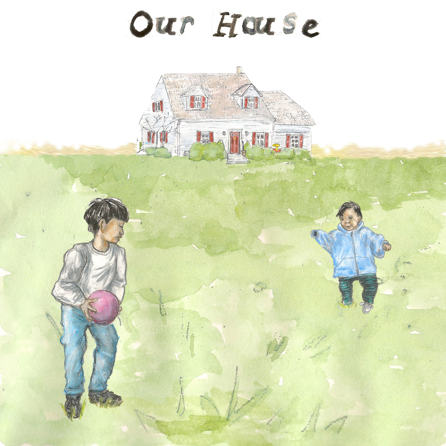
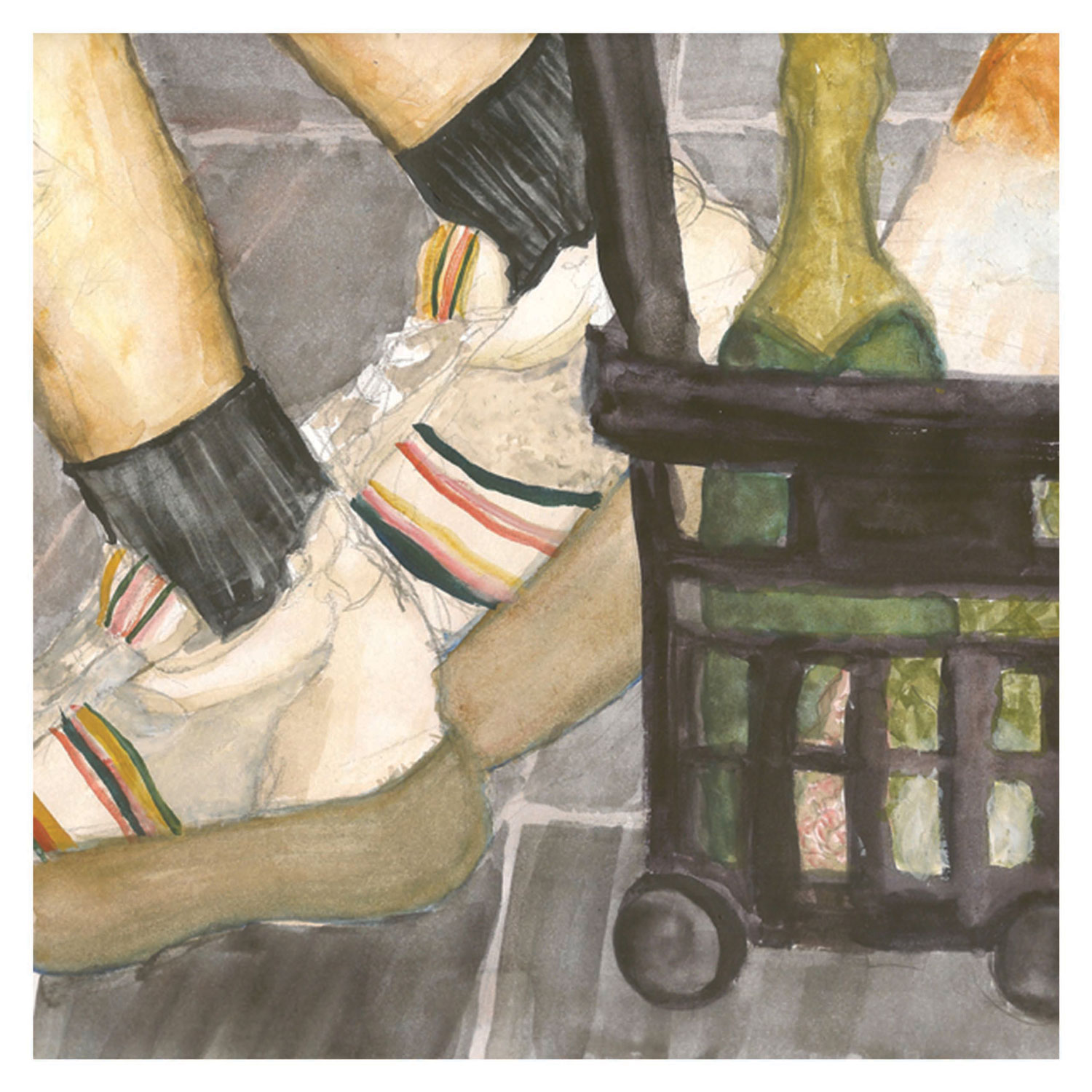
OUR HOUSE
This work is a short series of drawn and painted images based on photographs of my childhood. The short book presents my childhood home and a brief into conditions of my own adoption. Each image evokes a sentimental value which can be felt by the execution of its delicate medium. The title is inspired by Crosby, Stills, Nash & Young's song, "Our House."
/
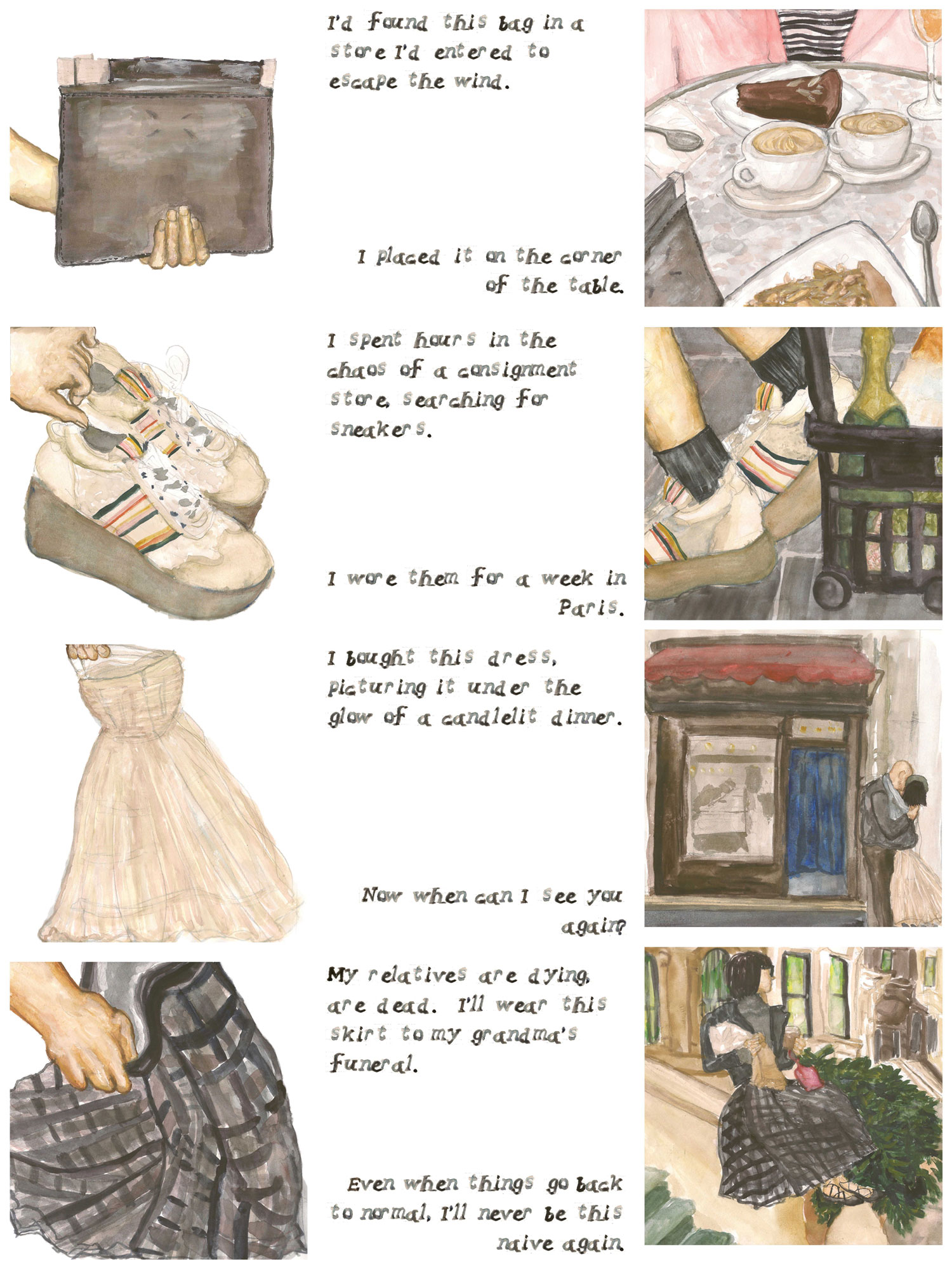
CLEANING OUT MY CLOSET DURING COVID 19
Cleaning out My Closet during COVID 19 is a 4 panel graphic narrative completed under the guidance of Lauren Redniss as a response to her course’s Spring 2020 Coronadiaries prompt. Cleaning out My Closet during COVID 19 serves as a visual poem memorializing material objects and the memories lived through them. During this time of quarantine, as we find ourselves reflecting on the past and re-evaluating our futures, simple actions, such as cleaning out one’s closet take on new meaning. As I sorted through my things, it felt like I was sorting through my past, as I discovered just how experienced these possessions were to me, and how connected my memories were to their materialities. Even as the dresses, and shoes, and bags were packed in boxes and sent elsewhere, the memories of me wearing them and their significance will be with me always.
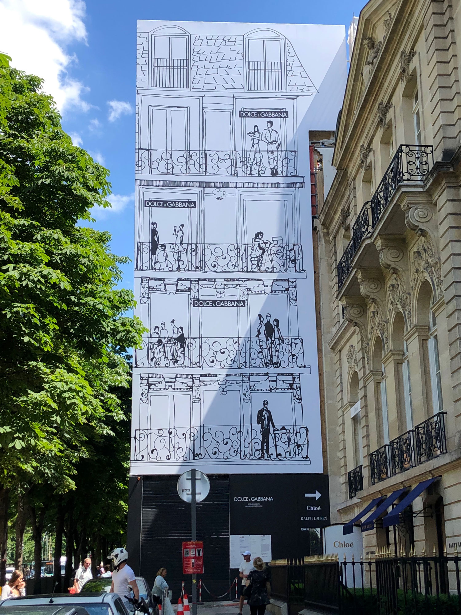
DOLCE & GABBANA X CHESFIELD X PARSONS PARIS
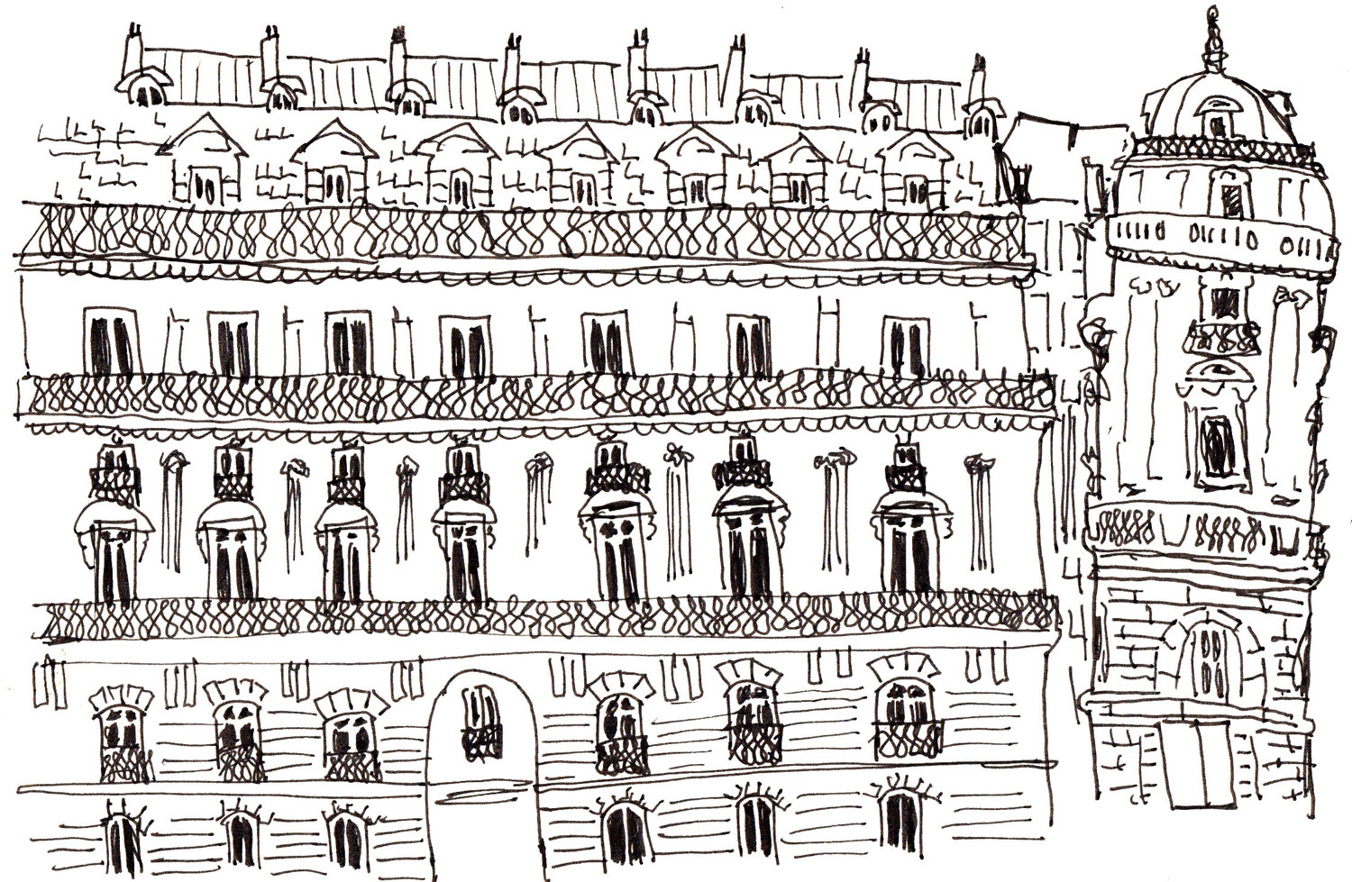
Over the span of the spring semester of 2019, Parsons Paris in collaboration with Chesfield realty development group, hosted a design think tank for the client Dolce & Gabanna, with the goal of creating a graphic design for a massive hoarding which would be mounted during property construction at the brand’s flagship Avenue Montaigne address. Amongst several different groups my personal contribution was picked as the chosen design by Stefano and Domenico. The design is titled, “Haussmanization,” referring to the signature architecture of Paris’s 19th century re-modernization. We took the brand identity and imposed it into the Parisian environment, merging both modernity and la mode.
/

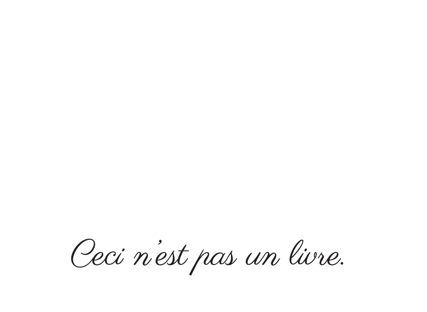
Treachery of the Book
Inspired by Rene Magritte's surrealist work "Ceci n'est pas une pipe," this simple book takes on complex existence as itt recognizes and refutes it's own consciousness. In its ideal printed format the paper book can be folded and played with, to turn the object into a lively character.
/

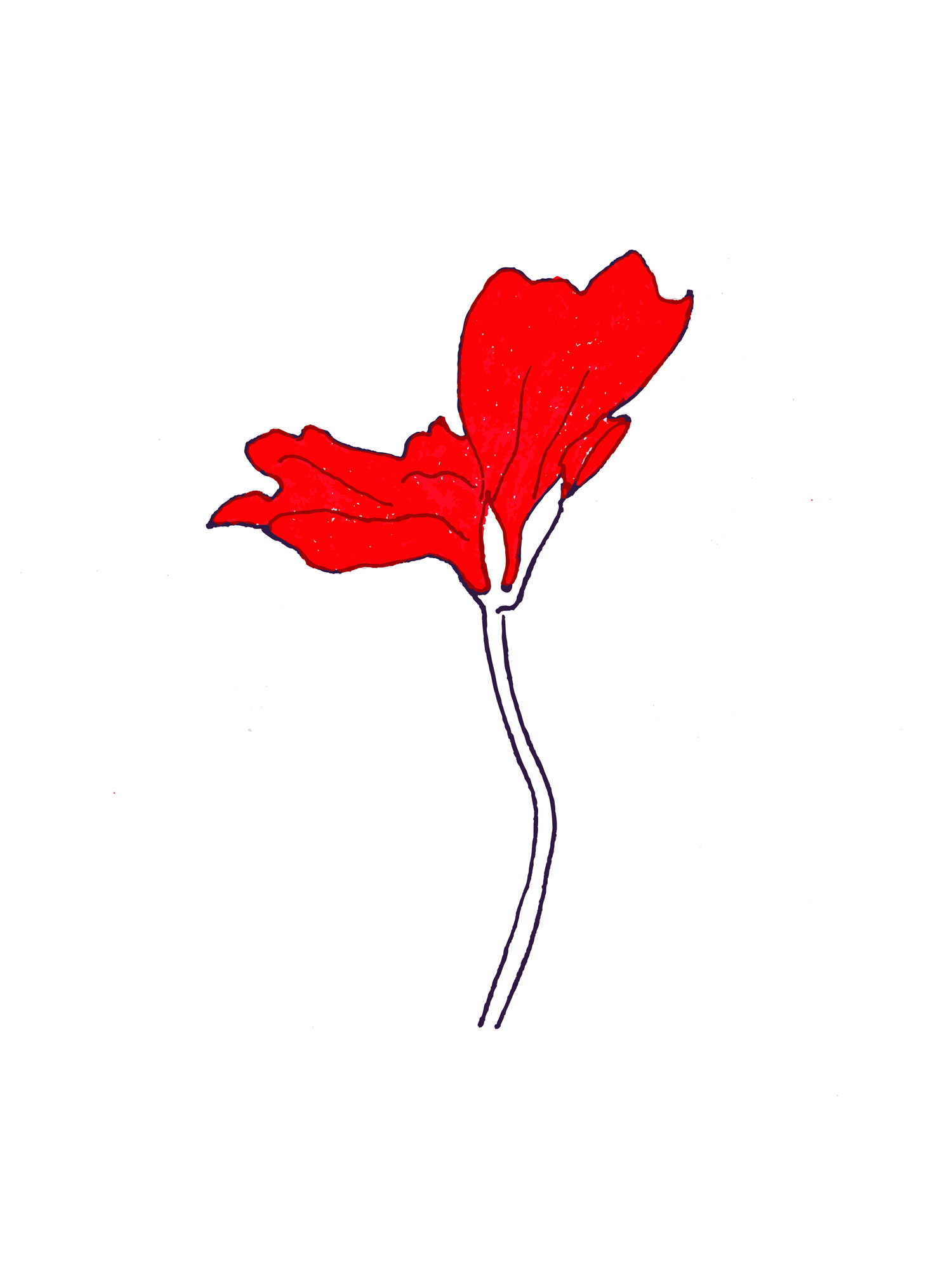
LA FLÂNERIE
In Paris one can stop and smell the roses, as one can stop and look at the red geraniums. One can commit la flânerie all day. Here it is not about the promotion you may get one year from now, it’s not about paying off the mortgage. It’s more about going grocery shopping everyday for fresh produce and a baguette, or having that glass of wine with friends over dinner. It is these simple habitual acts which bring the people of this city the most joy. The ideal of Paris is that the simple things are the most beautiful, the most articulate, the most full of life.
INFINITE PARIS
Built under the guidance of Sarah Garcin, Infinite Paris, is a digital webart experience created with hand drawn elements repeating themselves upon scroll. As the user scrolls horizontally through the work the architectural and vehicle elements reproduce themselves in a varied, random pattern, producing a niche depiction of a stylized Paris on the internet to live in infinite possibilities.
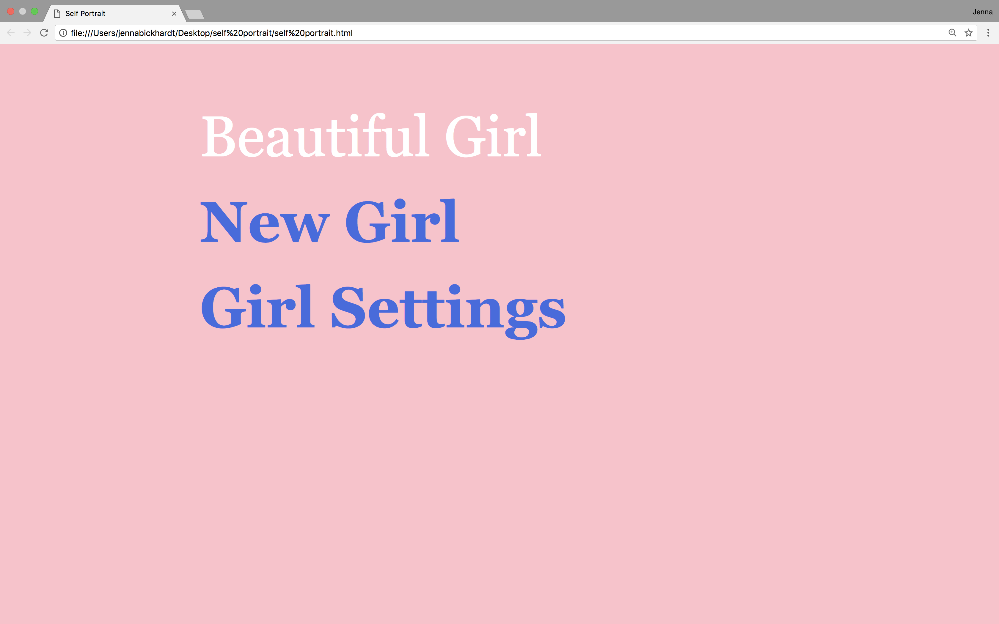
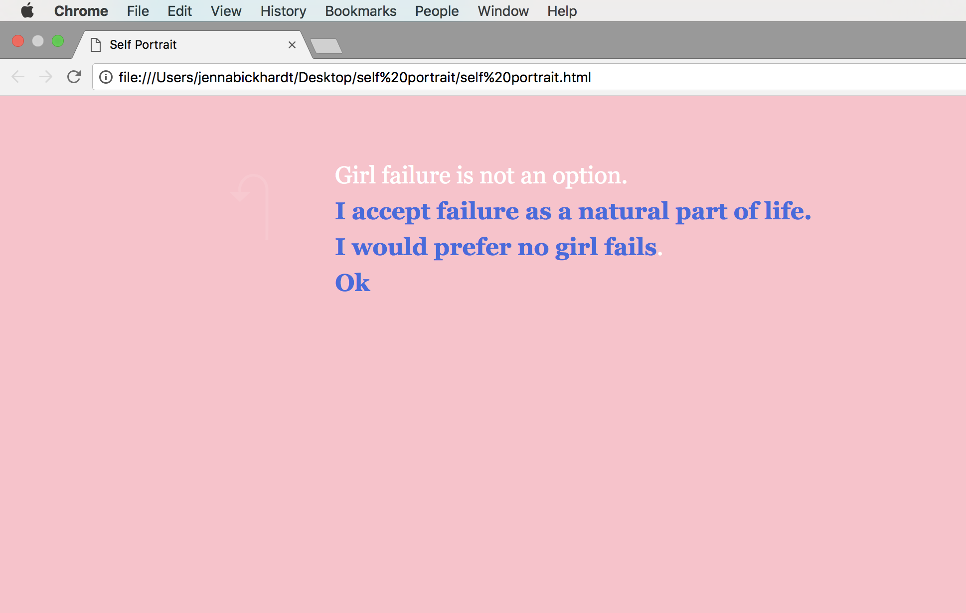
SELF PORTRAIT
This coded game serves as a platform for users to explore an autobiographical scenario, in which the player chooses within each page the action of the growing girl. The only options are “eat”, “cry”, or “sleep”, and as each choice is made, the game advances and the girl gains a year in age. However, as the game goes on it becomes more and more apparent that the avatar is deeply troubled and will be no matter what choices the user makes.
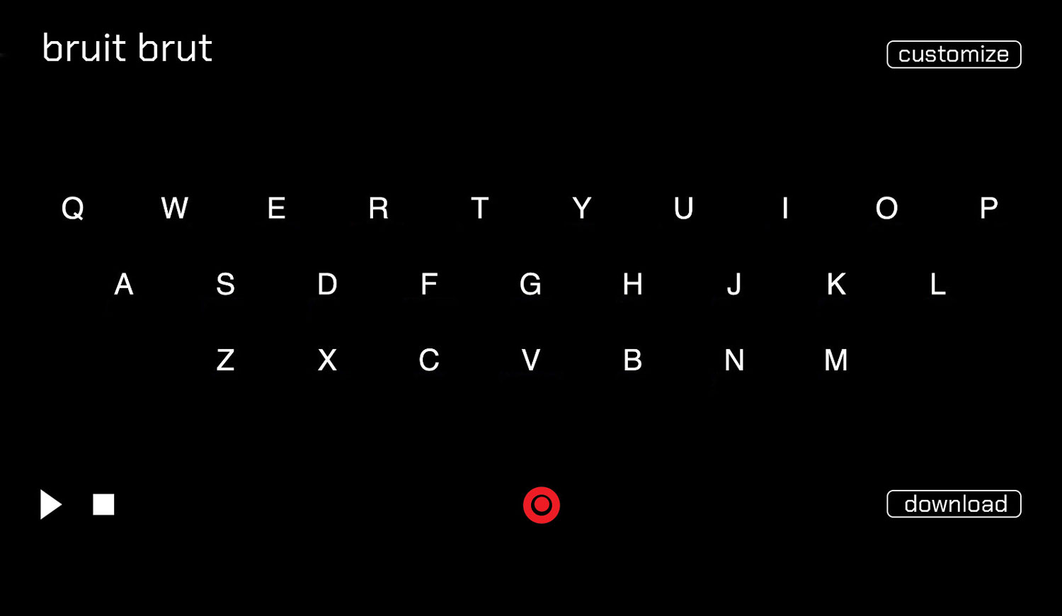
BRUIT BRUT
Bruit Brut is a digtal tool developed in partnership with Jonathan Riese and Nicholas Evans. The tool serves as an audio producer in the form of a coded keyboard. Each key can be adapted to link with an individual sound, and a record button allows documentation of the results.

HELLO WORLD
HELLO WORLD: A DIGITAL STORY ABOUT TELLING A DIGITAL STORY, follows the plot enacted by two in-screen avatars. Each window embodies an individual through its dialogue, accompanied by video and audio elements. Follow the characters as they struggle in their media existence and reach an eventual unification.
Meditation
Meditation is a film, inspired by ASMR videos, which present themselves with the purpose to relax the viewer. Our film will present itself as having the purpose to relax the viewer, but in fact will stimulate their mind with discomfort that results from hearing unpleasant sounds. Our concept is to demonstrate innate mental capacities to recall sound and imagery from memory, and realize how this mental imagination can still influence an emotional state. The tension lies between the discord of the calming essence of the roleplay and the negatively rousing content presented to the viewer.
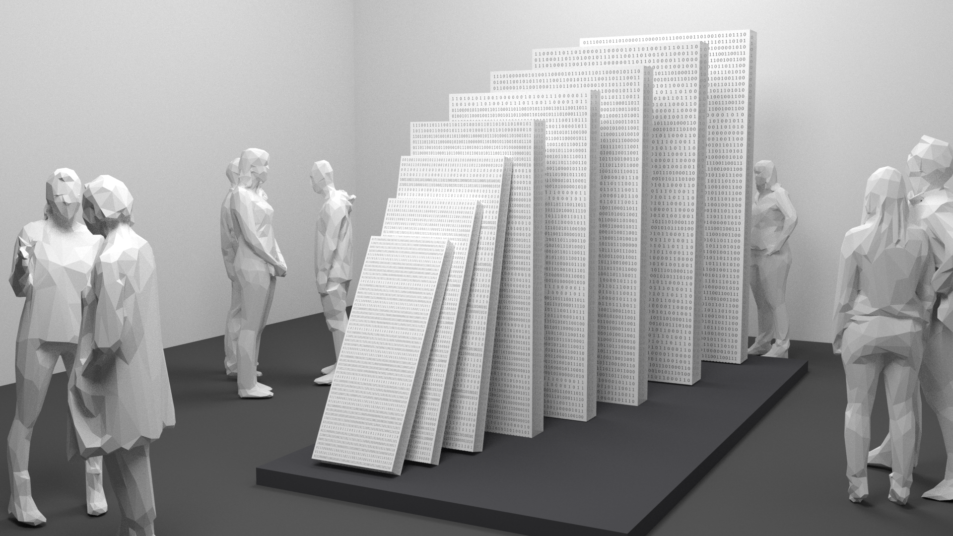
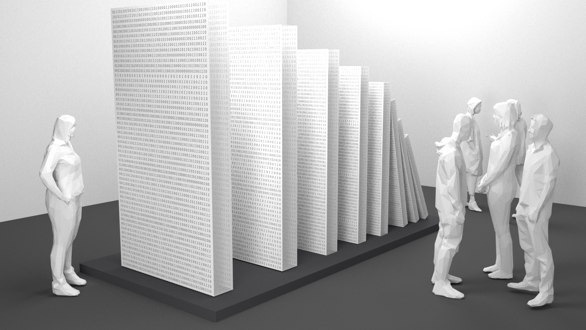
THE DOMINO EFFECT; OECD ANTI-CORRUPTION FORUM
The Domino Effect focuses on effects and causes in the context of trust within the realms of technology. The project is composed of eight dominoes which grow in ascending size upon viewer confrontation. The domino pieces are representative of choices and consequences, whether positive or negative, and their arrangement refers to the possible impact which occupies an exponential effect. Similar to the concept of a snowball effect, each choice causes a linked chain reaction which grows as it progresses. To represent these causes and effects, we have chosen specific vocabulary relating to these choices to be portrayed on each domino. To incorporate the technological aspect, we have filtered all vocabulary through a binary translator, turning letters to 1s and 0s.
/
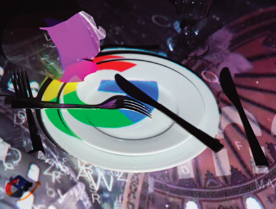
FINE DINING
Fine Dining is a video mapping installation featuring a fine dining setup (for one individual) and a takeaway box resemblant of the presence of food. The inspiration for this project is driven by the Milano Expo 2015’s Japanese pavillon, which featured a futuristic restaurant with digital food, and by the surrealist work of Meret Oppenheim, Luncheon in Fur. Whether online or offline, in reality or in the virtual world, the tech giants, Google, Apple, Facebook and Amazon (GAFA) have taken over and gained an incredible amount of influence in today’s world. While the GAFA offers a utopian future of convenience, an increased quality of life and interactions, many have already taken notice of their negative impact on the individual and the community. A major issue that is linked to the tech giants is consumerism, the driving force behind desire. In the consumerist world, the individual never gets the feeling of being fulfilled, of having enough. He or she always hungers for more.
/
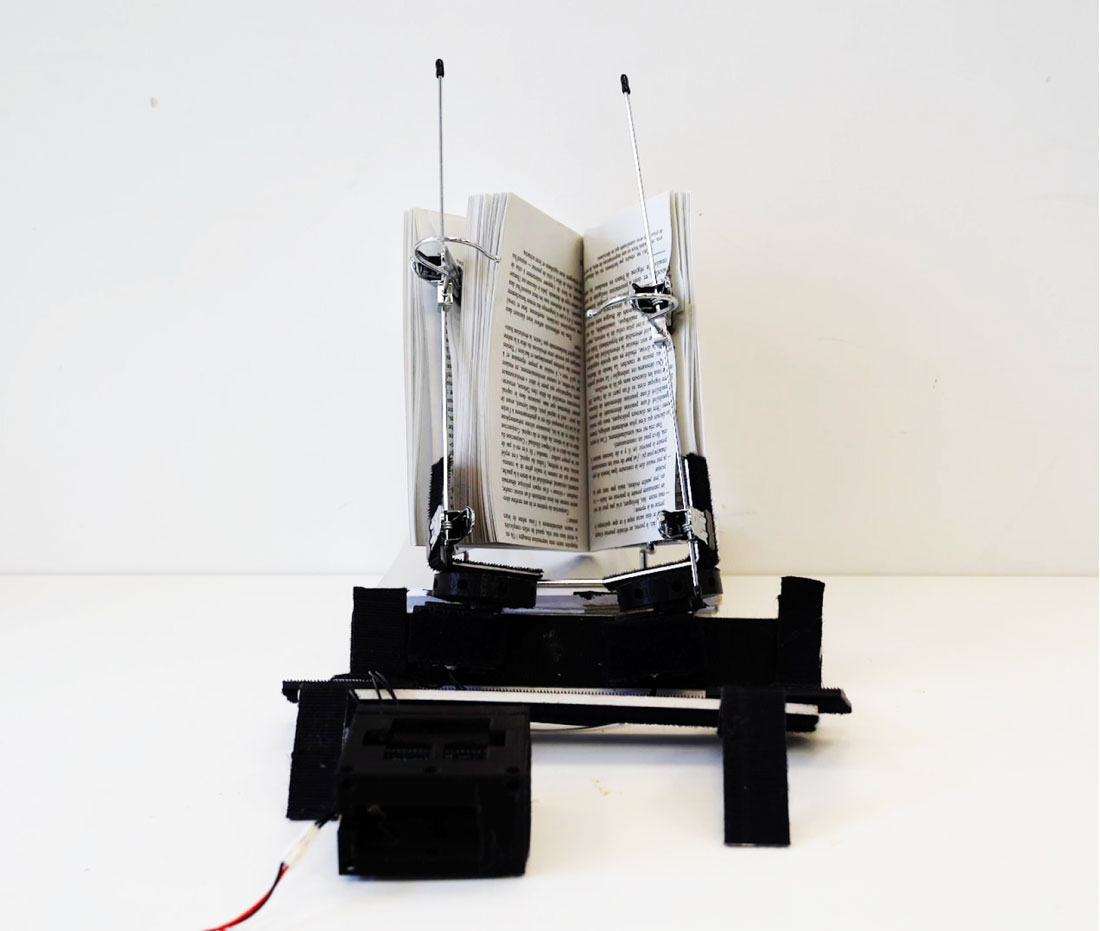
READING ROBOT
The book used for our project is called Simulacra and Simulation by Jean Baudrillard which explores postmodern theoriticization. The book discusses ideas of mass reproduction and copied creation to such a degree that nothing is authentic anymore. The idea is that we are not living in a real reality, but a reality established by notions of cultural expenditure established as simulation. In other words, the human experience in a simulation of reality. Here - we have a robot reading a book which establishes that due to technology and sociology and other conditions, our reality is nothing more than a construct, such as itself. The fact that the robot is reading the book upside down suggests that the action is also surreal.
/
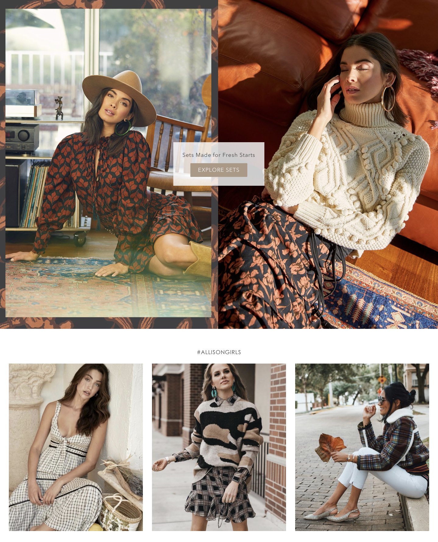
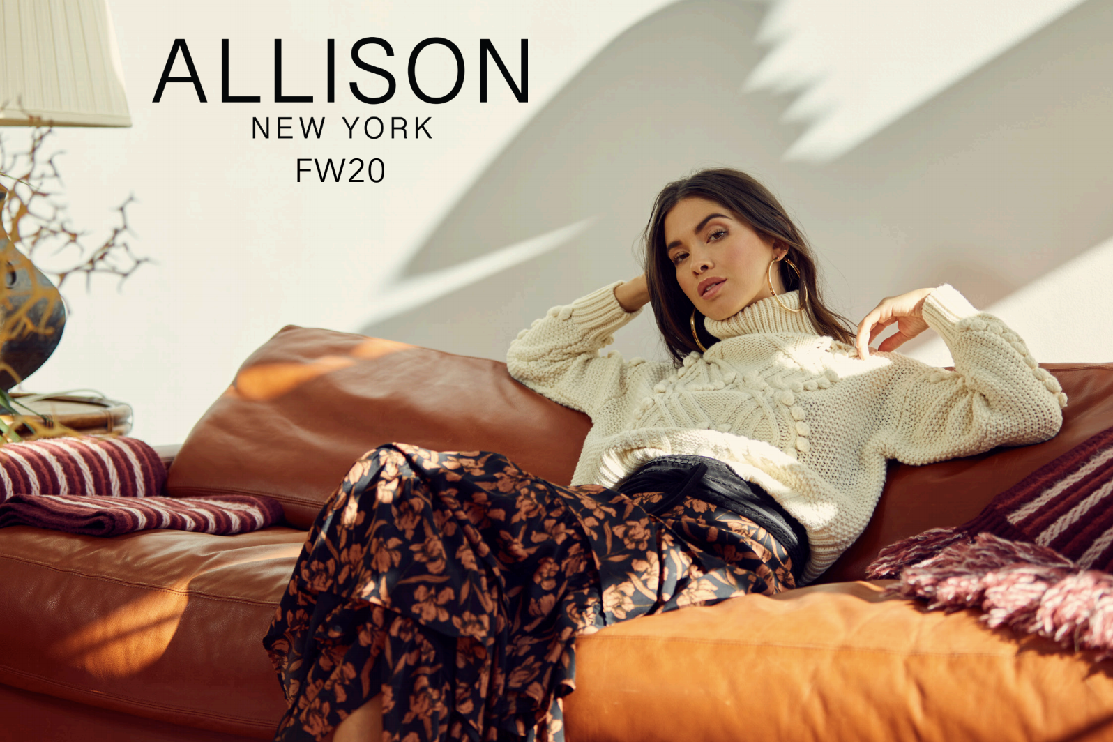
ALLISON NEW YORK
Working in the capacity of graphic designer for ALLISON NEW YORK during summer 2020, I advanced the brand's ecommerce site, in both backend and frontend design. I created and compiled the brand's marketing campaigns to their direct customers and wholesale buyers, created instagram ads, and was responsible for the FW20 press book, from layout to final print file. I designed the FW20 homepage and made several site design advancements to further integrate customer relationship management features.
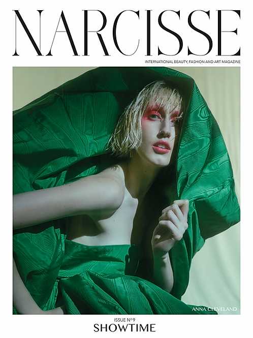
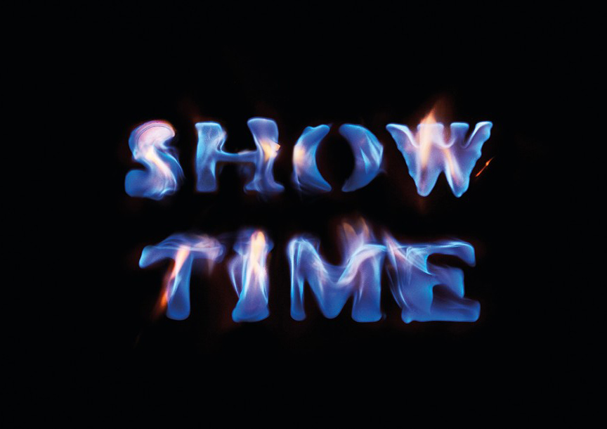
NARCISSE AGENCY
Working in the capacity of graphic designer for Narcisse Agency for one year, I assisted in the initial planning, layout, and production of their annual publication. This edition was titled Showtime and featured several high-profile cover photoshoots and advertisement and editorial campaigns, including clients such as Jean Paul Gaultier, Guerlain, Hugo Boss, and others. I was responsible in helping to produce both photos, videos, and moodboards prior to shoots, and creating several resulting proposal publications. Narcisse creates images which are ethereal in their materialities, a blend of high art and real world physicality which combines to create beauty.